![]()
Earlier this month, Microsoft announced a whole raft of updates to the way Bing presents search results.
The focus is on visual presentation, moving beyond the usual static list of text and links, providing searchers with rich formats designed to help them locate information quickly.
Here’s a rundown of the new features.
Infographic-inspired search panel
Microsoft says its aim is to provide both style and substance, providing information that’s easy to find and visually appealing. It does this through aggregating the top text and visual results into an infographic-type knowledge panel on the right, combined with lots of video and text links on the main results area.
![]()
In-image search
You can search on images in Bing, and also within images through the crop tool. For example, one of the results in your search for “coffee table” might have another object you want to explore, say a plant. Using the crop tool you can hone in on this element to search specifically for this item, clicking further to retailer sites if you want to make a purchase.
![]()
Local answers
The same design principle of aggregating information is applied for local answers. If you search on “things to do in Seattle” you’ll get results from a variety of sources. Instead of just images or text summary of one aspect of what you’ve searched for, Microsoft says Bing will provide a comprehensive overview of the subject, including maps, images, reviews and more.

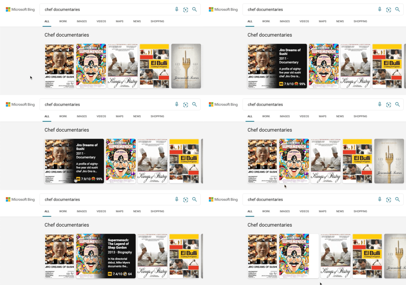
Expanding carousels
A carousel format shows the results’ high-level information to avoid crowding the page. Hovering over a specific result will expand it to show more detailed information.

Aggregated information, with interactive results
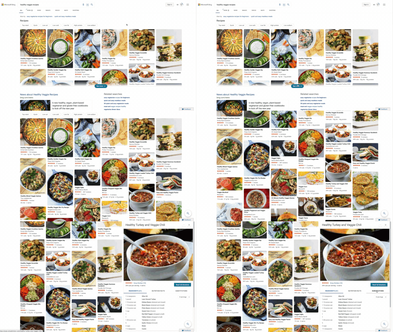
Microsoft says feedback shows people are overwhelmed by the sheer amount of information online, eg for recipes. Taking the topic of recipes as an example, their new search experience extracts and aggregates the most relevant recipes content and presents it in a single view on the search results page.
It shows images and high-level information such as calories per serving and reviews. How-to videos will play if you hover over. Clicking on a recipe expands it inline so you’re not leaving the page, and the expanded view shows further information such as ingredients, substitutions, a drop down menu for scaling to number of servings and nutritional information

Microsoft says these features are “new search experiences that quickly deliver information in a way that’s intuitive and engaging. The result is a visually rich format that allows you to quickly find what you are looking for without having to sift through large blocks of text.”
The results are certainly innovative, attractive and fun, and give Google a run for its money.